overview
role: product designer
team: 4 front, 2 back, po, pm, ba, 2 qa
platform: iOS and Android
Fora is one of Ukraine’s largest grocery retailers, with 300+ stores. The company focuses on convenient, friendly shopping experiences, both offline and online
overview
role: product designer
team: 4 front, 2 back, po, pm, ba, 2 qa
platform: iOS and Android
what I worked on
app redesign
3d graphics and animations
design system development
results
increased the App Store and Google Play rating from 3.0 to 4.6
increased company revenue by 5%
increased orders by 15%
The Ukrainian food retail market is highly competitive, so refreshing the app's design was essential. Outdated visuals and clunky flows made it difficult to attract and retain users
My challenge was to redesign the app to boost ratings in the stores (and increase installs), streamline ordering to grow average order value and the total number of orders
the cart was hard to spot and access
Address and time weren't clearly recognized as controls
inconsistent icons and outdated shadows
Categories lacked graphics, forcing users to read labels
Address and time weren’t clearly recognized as controls
inconsistent icons and outdated shadows
Categories lacked graphics, forcing users to read labels
the cart was hard to spot and access
I used market and audience research to analyze user needs
Synthesized feedback and ideas into 100+ actionable tickets, prioritizing improvements with RICE
Then I created 60+ wireframes to rethink flows, making navigation simpler and delivery features clearer
Developed a fresh design concept reflecting brand values with caring, rounded, animated design style
Designed handoff UI for 10+ flows with 300+ screens across iOS and Android
I also led design reviews that reduced UI bugs by 40%, helping preserve a polished look
can't add
items to cart from "Favorites"
can't add
to cart from receipts / past orders
lack
of filtering options
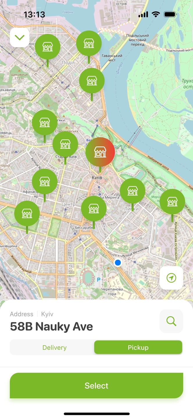
delivery
terms and cost aren't clearly available
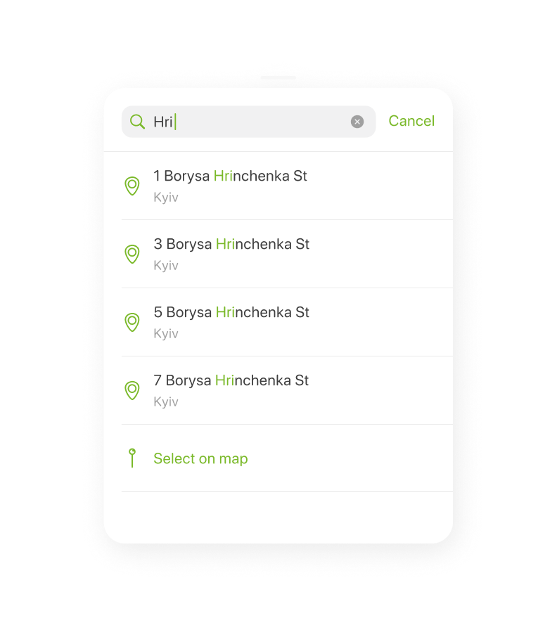
can't pick geolocation in app
first-time navigation is confusing; hard to find items
adding to
cart has delay (1-5 seconds)
some items
fail to add to cart at all
price
update lags when changing item quantity
some prioritised cjm tickets where more saturated = more critical
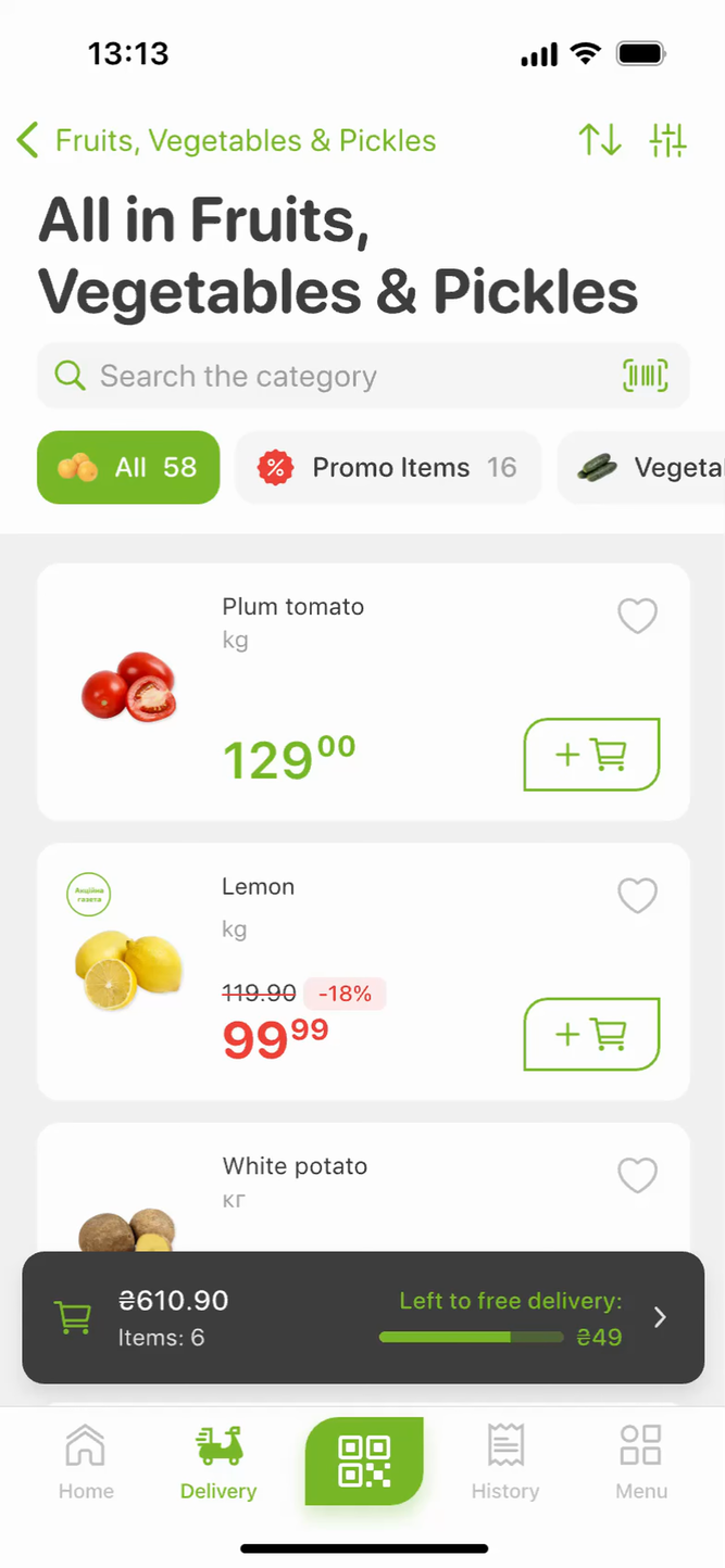
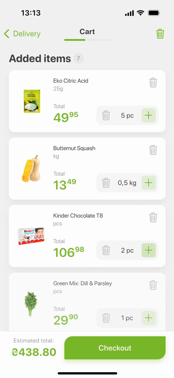
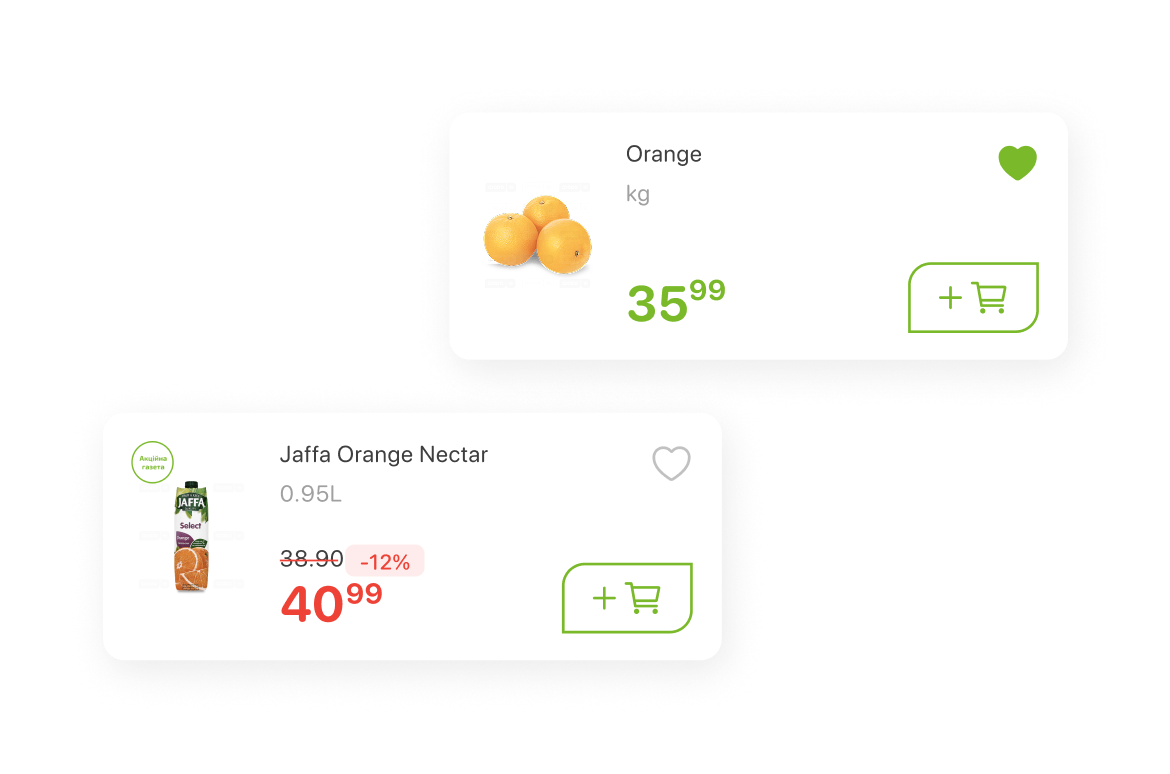
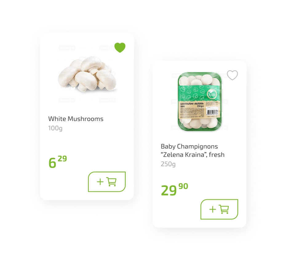
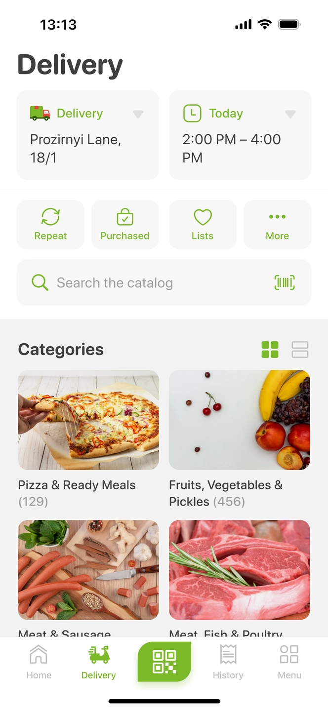
Visual categories and smart selection
Images on category cards made discovery instant. Recent address selection and quick time slots reduced selection time by 50%
Two-level categories navigation
Subcategory and sub-subcategory filters let users narrow down instantly which cut product search time by 30%
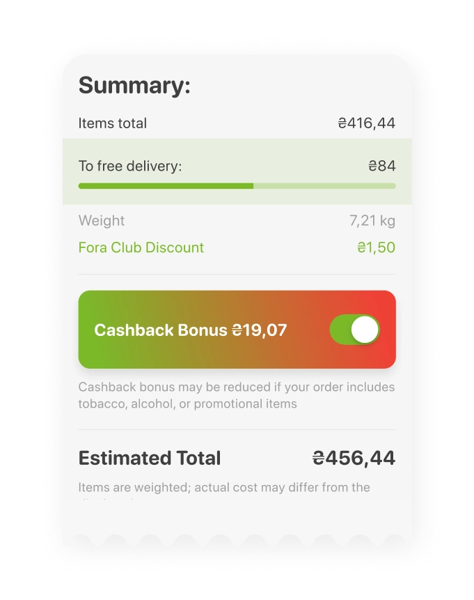
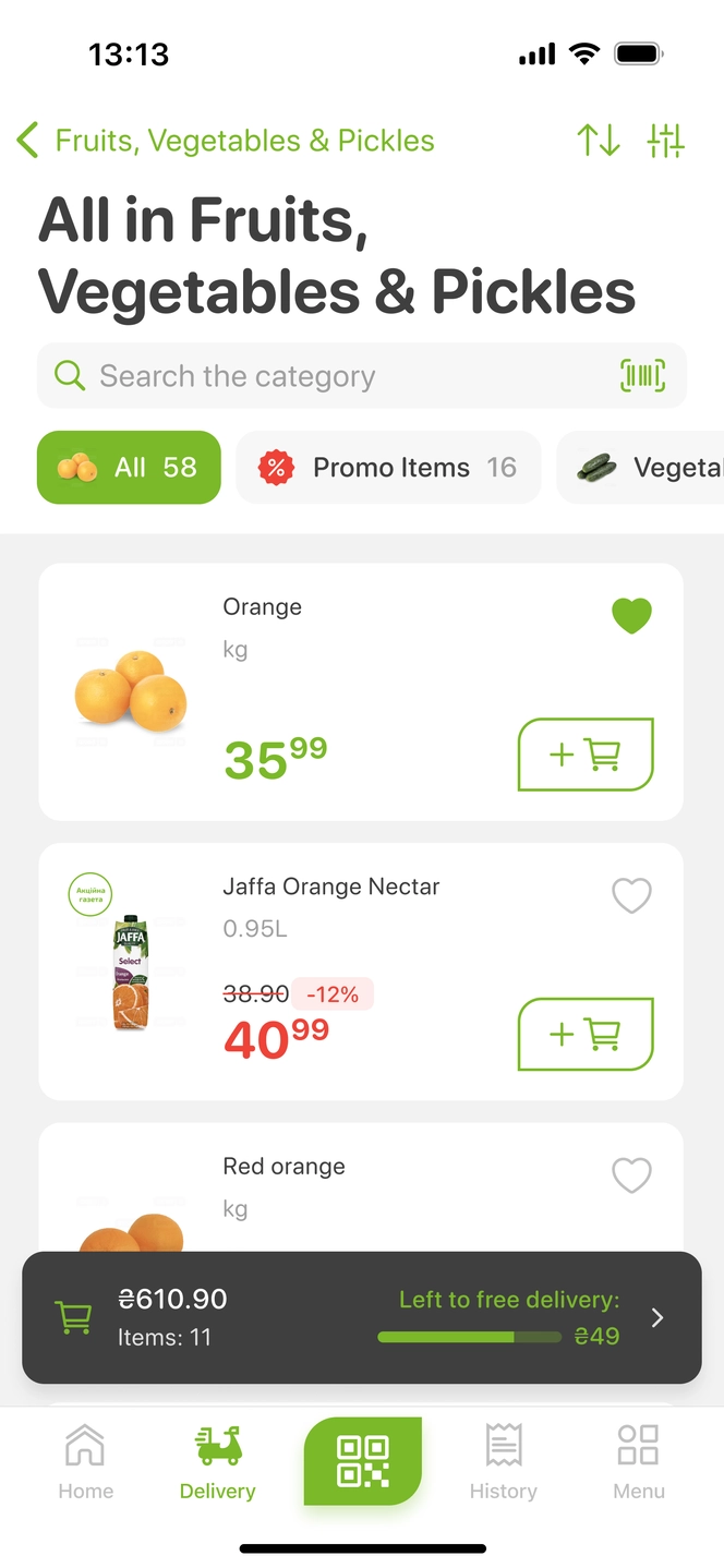
Free delivery progress and payment options
Free delivery progress bar increased average order value by 10%. Apple and Google Pay integrations lifted order volume by 15%
color palette
Unified the color palette across platforms, enhancing brand consistency
unified styles
Synced Figma and code styles with devs, reducing UI bugs by 40%
component library
20+ standardized components cut new feature time to market by 25%

finally the project turned for us into a shared adventure we truly enjoyed